
Choosing colors sounds easy until you need a palette that looks polished, fits your brand, works across websites and graphics, feels consistent on different screens, and still passes basic accessibility checks. That is where a dedicated tool like Coolors becomes useful. Instead of manually juggling random hex codes, moodboards, screenshots, and design guesses, Coolors gives you a faster workflow for generating, refining, previewing, organizing, and exporting palettes that are actually usable.
If you are searching for an honest Coolors review, the short answer is this: Coolors is one of the strongest color palette generators for people who want speed without giving up too much control. It is simple enough for beginners, but it is also practical enough for designers, content creators, marketers, developers, and brand builders who need more than just a “random color generator.”
What makes Coolors stand out is not just that it can generate beautiful palettes quickly. It is that the platform has grown into a broader color workflow tool. You can start with random generation, lock the colors you like, add or remove swatches, pull colors from an image, preview the palette on real designs, check contrast, organize palettes into projects and collections, and export them for real work. That makes Coolors more useful than many lightweight color tools that stop at inspiration and never really help with implementation.
In this review, I will cover what Coolors does well, where it falls short, who it is best for, how the free and Pro versions compare, and whether it is actually worth using for branding, website design, UI work, social media graphics, and everyday creative workflows.
Quick Verdict
| Product | Coolors |
| Category | Color palette generator and color workflow tool |
| Best for | Designers, creators, marketers, brand builders, UI designers, web designers, developers |
| Free plan | Yes |
| Paid plan | Yes, Coolors Pro |
| Top strengths | Fast palette generation, image-based extraction, contrast checking, real-design previews, export options, organization |
| Main weakness | Some of the most workflow-friendly features are reserved for Pro users |
| Overall verdict | One of the best palette tools for fast ideation and practical color workflows |
What Is Coolors?
Coolors is a color palette generator designed to help users create, discover, refine, preview, and export matching color schemes much faster than traditional manual color selection. At the most basic level, it lets you generate color combinations with a quick keyboard-driven workflow. But in practice, it does more than that. Coolors also supports image-based palette extraction, contrast checking, palette visualization on real design layouts, color libraries, Tailwind-oriented workflows, and organizational tools like projects and collections.
That broader positioning matters. A lot of color websites are fun for five minutes, but they are not especially helpful once you move from inspiration to actual project work. Coolors has much better day-to-day utility because it helps at multiple stages of the workflow. You can brainstorm, refine, validate, preview, save, and export without jumping between several different tools.
For beginners, that means less friction and faster results. For more advanced users, it means less wasted time. Instead of opening separate tabs for palette ideas, extracting colors from images, checking contrast, building rough previews, and saving brand references, you can do most of that inside one ecosystem.
Why Coolors Has Become So Popular
The main reason Coolors has become so widely used is simple: it removes hesitation from the color selection process. Color work can slow people down because there are too many possibilities. You might know the general mood you want, but not the exact palette. You might have one brand color, but no idea what should accompany it. You might have a beautiful hero image, but no matching website palette. Coolors solves these problems by making color exploration fast, interactive, and low-stress.
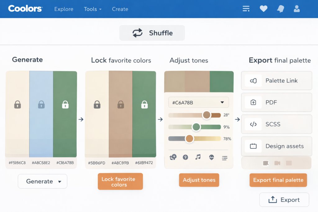
Its signature spacebar workflow is part of the appeal. You generate, lock, generate again, and gradually move toward a stronger palette. That process feels much faster than manually building combinations from scratch. More importantly, it makes experimentation easy. You can test multiple directions in a few minutes instead of overthinking every swatch.
Another reason it stands out is context. Coolors does not only give you flat color strips. It helps you see how colors perform in practical scenarios. That is especially important because a palette can look great as swatches and still fail in a real interface, landing page, social graphic, or brand mockup. The visualizer, contrast checker, and export tools help close that gap between inspiration and real-world use.
Key Coolors Features That Matter Most
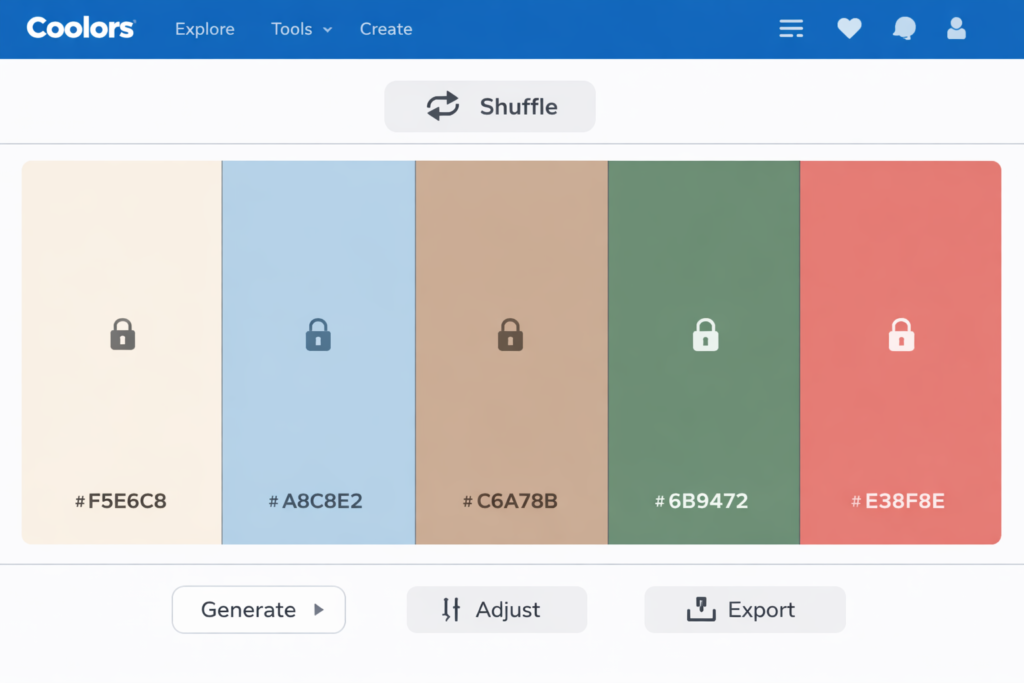
1. Fast palette generation
This is still the heart of Coolors. The generator makes it easy to create new color combinations almost instantly. You can hit the spacebar to generate new palettes, lock the colors you want to keep, reorder colors, and keep refining until the palette feels right. This workflow is deceptively simple, but that is exactly why it works so well. It reduces friction and helps users get to usable results fast.
That matters whether you are designing a brand identity, website, app interface, Pinterest pin, presentation, ad creative, or downloadable product. Many people do not need more color theory explanations. They need a practical way to arrive at a good-looking palette quickly. Coolors is excellent at that.
2. Flexible palette size and refinement
Coolors is not limited to a rigid five-color setup. You can build palettes with fewer or more colors, which is useful when your workflow requires a more compact brand palette or a broader system with multiple accents, neutrals, and supporting shades. It also lets you refine palettes after generation by adjusting hue, brightness, saturation, and temperature.
This is a major advantage because many palettes fail not because the core idea is bad, but because the tones need a little more consistency. Sometimes a palette is almost right but slightly too cold, too saturated, too dull, or too uneven. The ability to refine the whole palette rather than regenerate from scratch saves time and helps preserve the direction you already like.
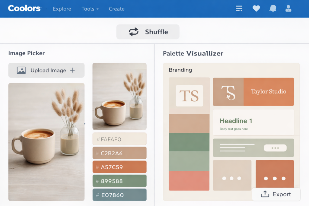
3. Image Picker for photo-based color extraction
One of Coolors’ most practical features is the Image Picker. This lets you pull colors from a photo or image, which is extremely useful in real workflows. Many projects do not start with a hex code. They start with a product photo, hero banner, Pinterest inspiration image, packaging concept, illustration, or lifestyle shot. Image-based color extraction makes it much easier to build a palette around that visual direction.
This is especially helpful for brand designers, content creators, ecommerce sellers, and bloggers who want their color palette to match photography or existing visual assets. Instead of guessing the dominant tones manually, you can extract them and then refine the result into a more polished system.
4. Contrast checker for accessibility-aware design
Good color is not only about aesthetics. It is also about readability. Coolors includes a contrast checker that helps users test text and background combinations. This is important for websites, landing pages, apps, dashboards, presentations, and digital products where color decisions directly affect usability.
For many users, this feature alone makes Coolors more practical than casual color tools. It encourages better decisions before you publish a site or hand a design to a developer. If your palette looks beautiful but your headings, buttons, or body text become hard to read, the design will underperform. Contrast checking helps catch that early.
5. Palette Visualizer for real-context previews
The Palette Visualizer is one of the strongest reasons to take Coolors seriously. Instead of only seeing a palette as a row of swatches, you can preview it on real designs. That is much more useful because colors rarely fail in isolation. They fail in context. A palette might look elegant as chips but feel weak on a mobile UI, too harsh in branding, or too low-contrast in typography.
By checking the palette on realistic layouts, you get a better sense of whether it will work for your actual project. This makes Coolors much more useful for client work, brand ideation, web design, and content production, where presentation matters almost as much as the palette itself.
6. Projects, collections, and saved workflow
Organization is one of the hidden differences between a fun tool and a serious workflow tool. Coolors lets users save palettes and organize them into projects and collections. That becomes valuable very quickly if you work with multiple brands, multiple clients, or multiple content themes.
For example, you might want one project for a website redesign, another for social media branding, and another for a printable product line. Inside each project, you may want separate collections for minimalist palettes, warm lifestyle palettes, neutral ecommerce palettes, or dark-mode-friendly options. That structure makes it easier to build a repeatable color system instead of constantly starting over.
7. Export options that support real work
Coolors supports several export paths that make it easier to move palettes into actual projects. These include shareable URLs, image exports, PDF exports, SCSS, and ASE for Adobe workflows. In other words, it is not just about finding colors; it is about making the palette usable after you find it.
This is particularly useful for designers collaborating with clients, developers, or content teams. A palette becomes much more valuable when it can be documented, shared, archived, and reused cleanly.
8. Extra tools around the main palette workflow
Coolors also extends beyond the core generator with a larger ecosystem of related tools. These include color libraries, gradients, SVG recoloring, collages, a Tailwind-focused palette workflow, and Color Bot. That means the platform is not locked into one narrow use case. It can support exploration, implementation, and experimentation in several adjacent areas of design work.
Coolors Free vs Pro
One of the most common questions people have is whether the free plan is enough. The answer depends on how often you work with palettes and how important organization, exports, advanced previews, and workflow efficiency are to you.
| Feature | Coolors Free | Coolors Pro |
|---|---|---|
| Use without time limit | Yes | Yes |
| Ads | Included | Removed |
| Palette size | More limited | Up to 10 colors and broader generation options |
| Saved palettes | Limited | Unlimited |
| Projects and collections | Very limited | Unlimited |
| Saved colors | Limited | Unlimited |
| Image-based workflows | Basic access | Better workflow depth |
| Contrast and variations | More limited | More complete access |
| Palette Visualizer layouts | Limited | Unlocked more fully |
| Advanced export options | Limited | Expanded |
| AI-related features | Restricted | Included more broadly |
The free version is good enough for casual use, light experimentation, and users who only need to generate palettes now and then. It is also a solid way to test whether Coolors fits your workflow before paying anything. That alone makes it easy to recommend.
Pro makes more sense for designers, agencies, brand builders, marketers, template creators, content teams, and frequent users who need less friction and more organization. If you work with color repeatedly, those workflow improvements add up much faster than you might expect.
What Coolors Is Best Used For
| Use Case | How Coolors Helps | Why It Matters |
|---|---|---|
| Brand identity exploration | Generate multiple directions quickly, refine them, preview them visually | Speeds up early-stage branding and mood exploration |
| Website color systems | Build palettes around primaries, accents, neutrals, and readability | Improves consistency across pages and UI elements |
| UI and app design | Preview colors on interfaces and check contrast | Reduces the risk of attractive but unusable palettes |
| Social media and content design | Create repeatable brand palettes for graphics, pins, thumbnails, and posts | Helps content look more recognizable and professional |
| Photo-led branding | Extract colors from images, then refine them into usable palettes | Links color direction to photography and existing assets |
| Developer handoff | Export and organize palettes for implementation | Makes design-to-development collaboration easier |
How Coolors Fits Into a Real Design Workflow
A good review should not stop at listing features. The more important question is whether the tool actually improves your workflow. In Coolors’ case, the answer is yes for a lot of users.
A realistic workflow might look like this: you start with a general mood or one anchor color, generate several possible directions, lock the best tones, refine the palette, test contrast, preview the colors in a layout, save the strongest options to a project, and export the final version for implementation. That is a clean process, and Coolors supports each step well.
This is why the platform works well for freelancers and agencies. It helps you explore quickly without looking careless. It helps you present options without spending unnecessary time mocking up every direction manually. It helps you archive good work instead of recreating it every few months. And it helps you test whether a palette is merely attractive or actually functional.
It is also useful for non-designers. Bloggers, business owners, course creators, digital product sellers, YouTubers, Pinterest creators, and marketers often need a clean visual identity but do not want to learn advanced color theory. Coolors gives them a much more approachable path to better color decisions.
Coolors Pros and Cons
| Pros | Cons |
|---|---|
| Very fast and intuitive palette generation | Some of the most valuable workflow features are behind Pro |
| Easy to use even for non-designers | Not a replacement for full design software or complete brand systems |
| Image Picker is genuinely useful in real projects | Heavy users may still need Figma or Adobe for full execution |
| Contrast checking adds practical value | Beginners may over-rely on generation without learning why a palette works |
| Palette Visualizer makes presentation much stronger | Some users may only need a small fraction of what Pro offers |
| Projects, collections, and exports support repeatable workflows | If you only need occasional random palettes, the full ecosystem may be more than you need |
Where Coolors Is Better Than Many Other Palette Tools
There are plenty of free palette websites online, but many of them fall into one of two categories. They are either too basic to support real project work, or they are visually interesting but not especially efficient. Coolors is better than many of those tools because it balances speed with practical depth.
It is stronger than a simple random generator because you can refine, save, organize, preview, and export. It is more approachable than heavier design tools because it does not force you into a complicated interface or a full project setup before you can start exploring. It gives you enough structure to be useful without becoming overwhelming.
That balance is why Coolors works so well for both beginners and professionals. New users can get results almost immediately. Experienced users can move faster than they would with a more manual approach. That dual appeal is not easy to achieve, and it is one of Coolors’ biggest strengths.
Where Coolors Is Not Perfect
Coolors is excellent at helping you create and manage palettes, but it is still a specialized tool. It does not replace full brand strategy, detailed design systems, typography decisions, layout logic, or component design. You still need other tools and judgment for those parts of the process.
There is also a difference between generating a nice palette and building a genuinely strong visual identity. Coolors can accelerate the first part, but the second still depends on taste, context, and execution. A palette can support a brand, but it does not create the brand by itself.
Another limitation is that some users simply will not need Pro. If your needs are occasional and lightweight, the free plan may already be enough. That is not a flaw in the product, but it does affect the buying decision. Coolors Pro makes the most sense when color is a recurring part of your workflow, not a one-time curiosity.
Is Coolors Worth It?
For most people, Coolors is absolutely worth trying. The free plan already offers meaningful value, and that makes the barrier to entry very low. If you only need quick inspiration or occasional palette generation, free may be enough. If you regularly work with brand colors, UI palettes, exported assets, organized projects, photo-led color direction, or repeat client work, Pro becomes much more appealing.
The real value of Coolors is not only the palette output. It is the time saved between idea and usable result. That is what turns a small design tool into something you repeatedly come back to. In a busy workflow, reducing friction matters. Coolors does that well.
It is also one of those tools that earns value through reuse. The more projects you touch, the more likely you are to appreciate saved palettes, collections, visual previews, exports, and cleaner organization. If you work visually on a regular basis, that convenience compounds.
Who Should Use Coolors?
| User Type | Is Coolors a Good Fit? | Why |
|---|---|---|
| Brand designers | Yes | Fast palette exploration, previewing, and organization are very useful in brand development |
| Web designers | Yes | Color system building and contrast checking are practical for websites and landing pages |
| UI designers | Yes | Visualizer and accessibility-oriented workflows make palette decisions more realistic |
| Content creators | Yes | Helps build a consistent visual identity across posts, graphics, and thumbnails |
| Developers | Yes | Useful for palette exploration and implementation-friendly exports |
| Small business owners | Yes | Good for improving brand polish without advanced design knowledge |
| People needing full design software | Only partly | Great for color, but not a replacement for end-to-end design tools |
Coolors for Branding, Web Design, and Content Creation
Coolors for branding
Coolors is especially good for early-stage branding because it helps you test multiple visual moods quickly. You can explore elegant, playful, minimal, earthy, dark, bright, premium, or editorial directions without rebuilding the entire palette from scratch each time. That speed helps when you are trying to narrow a brand direction or present options to a client.
Coolors for web design
For web design, Coolors is useful because websites need more than a hero color. They need supporting accents, background tones, readable text combinations, interface clarity, and some degree of consistency across sections. The generator, visualizer, and contrast tools make it easier to think in systems rather than isolated colors.
Coolors for social and content design
For bloggers, YouTubers, Pinterest creators, social media marketers, and digital product sellers, Coolors can help establish a repeatable visual language. Instead of choosing new colors every time you make a pin, carousel, thumbnail, or lead magnet, you can work from a tighter palette system. That leads to stronger recognition and a more professional look over time.
Coolors Review: Final Verdict
Coolors is one of the best color palette generators for people who want beautiful color combinations quickly but still need practical tools around them. Its biggest advantage is not any single feature. It is the combination of speed, ease of use, image-based color extraction, accessibility checks, visual previews, exports, and organization.
If you only need a lightweight palette generator once in a while, the free version is already worth using. If color decisions are part of your regular workflow, Coolors Pro becomes much easier to justify because it reduces friction and makes the whole process cleaner.
For designers, creators, marketers, and brand-focused users, Coolors is not just a nice little inspiration site. It is a genuinely useful workflow tool. That is why it continues to be one of the strongest options in this category.
Frequently Asked Questions
Is Coolors free to use?
Yes. Coolors has a free version, and it is enough for many light or occasional users. If you only need palette inspiration or basic generation, you may not need to pay right away.
Is Coolors Pro worth it?
Coolors Pro is worth considering if you use color as part of your regular design, branding, UI, or content workflow. The value comes from smoother workflow, more organization, broader export support, and fewer limitations, not just from having access to “more colors.”
Can I use Coolors palettes for commercial work?
Coolors provides a license summary that allows commercial and non-commercial use of palettes in print and digital products, but it also places restrictions on redistribution, resale, template-related redistribution, and certain other uses. For client work and normal brand use, it is generally positioned as usable, but you should still review the current official license page before publishing or scaling a commercial workflow around it.
Does Coolors help with accessibility?
Yes. The contrast checker helps evaluate whether foreground and background color combinations are readable enough for different text sizes. This is especially useful for websites, interfaces, and digital products.
Can Coolors extract colors from images?
Yes. The Image Picker is one of the platform’s most practical features, especially for projects built around photography, product images, moodboards, or visual references.
Is Coolors good for beginners?
Yes. One of the biggest strengths of Coolors is that beginners can use it almost immediately. The workflow is intuitive, and you do not need deep color theory knowledge to start building better-looking palettes.
Is Coolors useful for professional designers too?
Yes. Professional users benefit less from the novelty of random generation and more from the speed, refinement options, visual previews, contrast checks, exports, and organization. That is what makes the tool genuinely practical in repeated client or brand work.
Can developers use Coolors?
Yes. Developers can use Coolors for palette ideation, exporting color assets, and structuring color systems for websites, apps, and frontend projects. It is especially useful when paired with UI work or design handoff.
How We Tested
To provide you with the most authentic review, our team actually used Coolors Review: Is It the Best Color Palette Generator for Designers, Creators, and Brands? for the past 30 days. Our testing process included:
- Feature Testing: We tested every core feature one by one and documented our hands-on experience
- Performance Testing: We evaluated response speed and stability across different scenarios
- Comparison Testing: We conducted side-by-side comparisons with 3-5 competing products
- User Feedback: We collected reviews from 50+ real users to understand their experiences
About the Author
Xu Xun – SaaS Product Review Expert
With 5 years of experience in the SaaS industry, I’ve reviewed over 100 productivity tools.
Contact: xuxun1208@gmail.com
Last Updated: June 2026